Blazor UI Common Dialogs
Use case: Most applications use some type of confirmation
dialog to validate that a user really wants to do an action such we delete a
record or leave a page without saving.
Some need a simple form to allow the user to input a simple value,
rename an object etc.
For this project I went with the server-side application,
but everything would work the same for the client-side application. See Blazor.Net for a description of the difference.
Needing these myself, I thought it would be good to create a
Common Dialog component to use in my allocation. The first step was to identify
what are the common parts. I came up
with these:
Common Dialog
1.
Heading
2.
Message
3.
An action to perform
So, these are the parameters I am going to use for my common
dialog. But first, I want my dialogs to
be modals. For this I just used Chris
Sainty's Blazored Modal NuGet package. You
can see how to use that from one of my previous blogs. I also want to provide feed back from what
the user did in the dialog. For this a
used Chris’s Toast NuGet package. You
can see how to use that from another one of my previous posts.
Once I added those NuGet packages and configured them, I was
ready to build out my common dialog. I
created the parameters with some defaults:
[CascadingParameter] ModalParameters Parameters { get; set; }
private string heading = "";
private string message = "Please click YES to confirm";
private CommonDialogTypes action = 0;
private string iconClass = "fas fa-check";
protected override void OnInitialized()
{
if (Parameters != null)
{
heading = Parameters.TryGet<string>("Heading");
message = Parameters.TryGet<string>("Message");
action = Parameters.TryGet<CommonDialogTypes>("Action");
}
}
I am setting the local variables from the parameters passed
in. I am using the TryGet in case the
value is null. If it is null, we will
just use an empty string. I did create
an Enum to allow the user to easily pick the type of confirmation they wanted.
public enum CommonDialogTypes
{
ConfirmationOk = 1,
ConfirmationYesNo = 2,
ConfirmationOkCancel = 3,
ConfirmationWarn = 4,
SimpleInput = 5
}
Each dialog has an icon associated with it. I left those hard coded for now, but you would
have made a parameter out of those as well.
For the icons I am using Font Awesome.
I find these to have the best selection and are easier to use. You just need to include the link in the
_Host.cshtml page for server side or the index.html page for the client-side
application.
<link rel="stylesheet" href="https://use.fontawesome.com/releases/v5.8.1/css/all.css" integrity="sha384-50oBUHEmvpQ+1lW4y57PTFmhCaXp0ML5d60M1M7uH2+nqUivzIebhndOJK28anvf" crossorigin="anonymous">
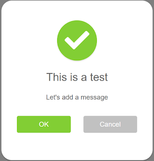
I created the UI for the dialog using bootstrap:
<div id="myModal">
<div class="modal-dialog modal-confirm">
<div class="modal-content">
<div class="modal-header">
<div class="icon-box">
<i class="@iconClass"></i>
</div>
<h4 class="modal-title">@heading</h4>
</div>
<div class="modal-body">
<p class="text-center">@message</p>
</div>
<div>***Buttons go Here***</div>
</div>
</div>
</div>
Buttons
Now we are ready to add buttons. Now with the buttons a new set of options came
to light. In my first pass I just coded
this with in the common a dialog page, but then I noticed the patterns to the
buttons. I create a new component for
the buttons and came up with these common traits:
1.
Button Label
a.
OK vs Yes
b.
Cancel vs No
c.
Just the Ok button
2.
Button Colors
a.
On warning dialog, I wanted to have the buttons
stand out a little more.
3.
Weather to Just have the Ok button
4.
What methods to call on the click events, this
one turned out to be very interesting.
With this list, an OKCancelButton UI component came to mind.
<div class="@btnClass">
<button class="btn btn-block ok" @onclick="HandleOk" style="background:@OkBtnColor">@OkBtnLabel</button>
</div>
@if (!OkBtnOnly)
{
<div class="col-6">
<button class="btn btn-success btn-block" @onclick='HandleCancel' style="background:@CancelBtnColor">@CancleBtnLabel</button>
</div>
}
Here are the parameters
[Parameter] public string OkBtnColor { get; set; } = "#82ce34";
[Parameter] public string CancelBtnColor { get; set; } = "#c1c1c1";
[Parameter] public bool OkBtnOnly { get; set; }
[Parameter] public string OkBtnLabel { get; set; } = "OK";
[Parameter] public string CancleBtnLabel { get; set; } = "Cancel";
[Parameter] public Func<Task> OnOk { get; set; } = null;
[Parameter] public Func<Task> OnCancel { get; set; } = null;
With the parameters I wanted to make sure I had defaults set
for them so that the user would not have to set them if they did not want to change
the default values. It makes the user of
the component cleaner.
To Use the Component with defaults
<OkCancelButtons
/>
What do the parameters do
OKBtnColor and CancelBtnColor – these lets the caller set
the color of each button to what ever they want just by providing any CSS color
value.
<OkCancelButtons
OkBtnColor="#f15e5e"
CancelBtnColor="c1c1c1"
/>
OKBtnOnly – This is a flag when set to true will only show
the OK button. When this flag is set, we
need to adjust the class on the main div to a column of 12 (col-12) instead of
the default of 6 (col-6). This will the single
button to be centered.
<OkCancelButtons
OkBtnOnly="true"/>
OkBtnLabel and CancelBtnLabel – These allow the caller to
set the text of the different buttons.
For example, if you want to use Yes and No instead.
<OkCancelButtons
OkBtnLabel="Yes"/>
OnOk and OnCanel functions – The caller can pass in the call
back functions for either of these button clicks if they want to handle that event. If no function is provided, the onclick events
will default to the standard modal function that are defined in the common
dialog.
Set the functions
<OkCancelButtons
OnOk="HandleYes" OnCancel="HandleNo" />
Default Event Handler
private Task HandleYes()
{
string returnMessage = "Yes";
if(action == CommonDialogTypes.SimpleInput)
{
returnMessage = inputValue;
}
ModalService.Close(ModalResult.Ok<string>(returnMessage));
return null;
}
private Task HandleNo()
{
ModalService.Cancel();
return null;
}
Input Dialog
The thought behind this common dialog is when you need to
get a simple single input from the user.
In my user case, I use it most when I am working user defined
picklist. I like to have users define their
own options for pick list. I can create
a simple ui and use this common dialog to get the new value.
To add this to the common dialog I just check for the simple
input action and display a HTML input field and bind that field to a
variable. In this case, inputValue.
@if (action == CommonDialogTypes.SimpleInput)
{
<input type="text" class="form-control" placeholder="enter in value" @bind="inputValue">
}
In the on click event for the accept action, we simply set
the return value of the modal to the value of the inputValue variable.
if(action == CommonDialogTypes.SimpleInput)
{
returnMessage = inputValue;
}
ModalService.Close(ModalResult.Ok<string>(returnMessage));
Triggering the Common Dialogs
I used the index page to display the buttons and wire in the
calls to each type of common dialog
<button @onclick="@(e => ShowModal(CommonDialogTypes.ConfirmationYesNo))" class="btn btn-primary">Yes - No Confirmation</button>
<button @onclick="@(e => ShowModal(CommonDialogTypes.ConfirmationOkCancel))" class="btn btn-primary">OK-Cancel Confirmation</button>
<button @onclick="@(e => ShowModal(CommonDialogTypes.ConfirmationWarn))" class="btn btn-primary">Warning Action</button>
<button @onclick="@(e => ShowModal(CommonDialogTypes.SimpleInput))" class="btn btn-primary">Input Value</button>
<button @onclick="@(e => ShowModal(CommonDialogTypes.ConfirmationOk))" class="btn btn-primary">Ok Only</button>
The on-show modal is the standard one we use
void ShowModal(CommonDialogTypes action)
{
var parameters = new ModalParameters();
parameters.Add("Heading", "This is a test");
parameters.Add("Message", "Let's add a message");
parameters.Add("Action", action);
Modal.OnClose += ModalClosed;
Modal.Show<CommonDialog>("", parameters);
}
Summary
This UI component turned out a lot better that I thought it
would have when I started it. I will definitely
be using this in my applications moving forward and I will be putting in my UI
library once I actually build that.


%20built%20with%20Blazor.%20The%20scene%20features%20a%20dynamic%20web%20app%20running%20o.webp)

Comments
Post a Comment