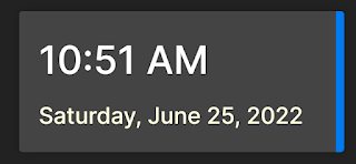
I wanted to build a component that would utilize a dynamic class for styling. I came across a nice component that displays the date and time and this post is how I created a Blazor component from it that uses a dynamic style.
We want to be able to do this so we are not changing the component code everything we using. This is very helpful if the component is part of a UI library.
The code in this post was built on .Net 6 using Visual Studio 2022
Project break down
Basic control
The first step was to just build the control as part of a regular page. The index page was used. The HTML is fairly straight forward:
<div class="datetime">
<div class="time">@DateTime.Now.ToShortTimeString()</div>
<div class="date">@DateTime.Now.ToLongDateString()</div>
</div>
I am just using the DateTime function to generate both the date and the time. We can use the ToString formatting to display the format we are looking for.
Once we have the date time displaying in the format, we need to update it every time the minute changes. There are a couple of ways of implementing this. I went with a simple timer. You could also have used the new PeriodicTimer.
The timer code is just a few lines so the standard timer made since. We set the timer up for an internal of 500 milliseconds. We can make this any value you want. But we want the display to update at least every minute.
Once the timer fires, since with went with displaying the value from the Date time method, we just need to update the UI thread. The timer is running on a different thread so we ahve to use the InvokeAsync to update the UI thread:
private void OnTimerInterval(object sender, ElapsedEventArgs e)
{
InvokeAsync(() => StateHasChanged());
}
The last thing we need is to make sure provide a Dispose method to release the timer:
public void Dispose()
{
timer?.Dispose();
}
Turn control into a component
Once the basic code is running and working, we can turn it in a Blazor component. The steps to do this are well documented. Here is my first post about it, Basic Component. That post is a little old, so I will go over the steps here as well.
Step 1:
Using your Editor of Choice, create a new Blazor component.
Step2:
Add the HTML and C# code to the new component. You could create a new code behind file and place the C# in that file as well.
Step3:
Provide CSS isolation. Create a new CSS with the same name as your component but add a .css extension. This binds the styling to just the new component. In the source provided, I changed the CSS used to show that it was pulling from the isolated CSS file.
Step4:
Add the new component to a Blazor page. For the demo I used the counter page:
<DateTimeBasicComponent />
That's it. When you run the app, you will see your new component on the counter page.
Adding Dynamic Styling
The last part is the fun part. We want to add a CSS class for the component to use so we can control the look of the component without having to change the base code.
There are several steps we will need to implement to add this feature.
Step1:
Make the current CSS class "datetime" soft. To do this we will create a private variable called "dsiplayClass" and default it to "datetime".
private string displayClass = "datetime";
Step2:
Add the new variable css class name to the HTML:
<div class="@displayClass">
<div class="time">@DateTime.Now.ToShortTimeString()</div>
<div class="date">@DateTime.Now.ToLongDateString()</div>
</div>
Step3:
Add a parameter to the component. We default it to an empty string. This will allow our isolated class to be used. A parameter must be implemented as a public property:
[Parameter]
public string ClassStyle { get; set; } = "";
Step4:
We need to check the parameter passed in, if any, and set the displayClass to that value. We will want to do that in the OnInitializedAsync method.
protected override async Task OnInitializedAsync()
{
if(!string.IsNullOrEmpty(ClassStyle))
{
displayClass = ClassStyle;
}
await Task.CompletedTask;
}
Step 5:
The last step is to pass in the new CSS style class we want to use:
<DateTimeWithParas ClassStyle="datetime2" />
Again in the demo I change the styles so you can see which CSS it was using.
That's it, we now have a date time component that we can change the styling on, including position, dynamically. To me, that is pretty cool.
CSS Tip
If you noticed from the HTML, there are separate classed for the date and the time, but we are only passing in the new CSS class for the main div. So how are we changing the style of the inner divs.
I am sure there are a number of ways to use CSS selectors that would work for this, I went with the selection an inner class. It is very readable and works great:
.datetime2 {
font-size: 10px;
padding: 15px;
color: #b32121;
background: #444444;
box-shadow: 0 0 10px rgba(0, 0, 0, 0.25);
border-radius: 4px;
border-right: 10px #007AEF solid;
width: 200px;
font-weight: 500;
font-family: "Inter", sans-serif;
}
.datetime2 .time {
font-size: 1em;
color: green;
}
.datetime2 .date {
margin-top: 10px;
font-size: 1.75em;
color: olivedrab;
}
Summary
This was a fun project that has given me a nice component to display the date and time. We could add additional parameters like show only date or time, change the format of the date of time.
This control shows the true power that Blazor has by making and using components.

Comments
Post a Comment