Jumped feet first with Blazor and TailwindCss
I watched an incredibly good presentation by Chris Sanity on using
Tailwindcss with Blazor. Chris had it look so quick and easy. I was so
impressed that I decided right then I had to learn how to use it. This post is
about the experience that I went through to learn Tailwindcss and whether I
still think it is worth the effort. Spoiler Alert: It is very
worth it.
So, to show that I could use
Tailwindcss on a real application, I took the standard Blazor Server template
and created an application. There are three pages, Index, Counter, and Fetch
Data. I then removed all references to Bootstrap. I wanted to start with just
the HTML code.
I have broken this post out into
"Lessons Learned", "Pros and Cons" and "Style changes
I made between Bootstrap and Tailwindcss.
Lessons
Learned
- If you do not understand native CSS, you should not use
Tailwindcss.
- Since Tailwindcss is a set of utility classes, you must
understand the underlying CSS commands you are working with. This holds
true especially for Flexbox and Grid.
- After of few frustrating days of trying Tailwindcss, I
had to stop, go back, and really understand some of the CSS commands I
have been using, but not really knowing what they did.
- The more you know native CSS the easier and faster
Tailwind is.
- I started a routine of doing some Tailwinds coding every
day, so I do not lose what I learned from all this.
- Every blog post and video I watched learning
Tailwindcss, said this.
- Start with no HTML or C# code.
- I started out just matching the Bootstrap CSS element
by element. This was an unbelievably lousy idea. But to be honest,
that is how I have been using Bootstrap for a long time.
- Once I took a step back and started with a blank HTML file, things took off for me.
- Tailwindcss is a build system, not a CSS framework.
- Do not expect your page to refresh with your style
changes automatically or via a browser refresh. Tailwindcss only includes
the style you are using. If you add a new style you have to rebuild the
output file.
- There are several resources that explain this and how
to "automate" it. It works well, as long we you remember to
start the watcher.
- I did lose some time making changes and wondering why
they did not show.
- Always have a design document, no matter how simple you
think the UI is.
- In addition to starting fresh, I started using the
basic application as a "design document".
- In other words, not as a step-by-step instruction, but
more of the wanted end result. This freed me up to "think outside
the box"
Pros
and Cons
Pros
- It's fast to use
- Once I really understood the native CSS, it took less
than a day to style the app.
- For me, that is unheard of. I have sent a week on just
a log-in form
- Allows a lot more creativity
- I did not deviate too much from the basic app look and
feel, but it would have been easy to embellish it
- This is true with working with the Fetch data page
- Easy to use
- I followed the instructions I learned. You start at the
top of the page and style working your way down the page.
- I even got to the point where I did not have to look up the
Tailwind commands because they just made sense.
- Simplified my CSS
- You are using a utility class, so it is easy to use the
same size of your styles. For example, you can set a margin and it is the
same everywhere, not 1.24 rem here, 24px there, etc.
- Standardized my CSS
- I did not use the @apply feature, but this would make
it amazingly easy to make default styles for various parts of your
application and all really be the same.
- The resulting application is a smaller
- Bootstrap project source file size: 781Kb
- Tailwindcss project source file size: 40Kb
- This is the result of only including the styles you
use
- It is also a result of switching open Icon to
Font-Awesome
Cons
- It is a build system
- I talked about this above
- It turns into just a minor inconvenience
- Separation of concerns
- This is one of the agreements against
Tailwindcss.
- Since you are using utility class, it starts to look a
lot like inline styling, which we learned years ago is bad.
- This was a hurdle for me at first. But I
realized it is not really like that. You just use more classes.
- It is similar to Bootstrap. For example, you btn
btn-primary, etc.
- Lots of classes in the HTML
- This is a true statement.
- After a while, I just got used to it.
- I do like the fine granular adjustments you can make
easily
Style
Changes made
- Used Font-awesome icons instead of open-iconic
- I needed help with the open-iconic icons and getting them
to be styled right.
- I tried the SVG ones instead of the Bootstrap ones
- Font-Awesome also is more popular and has more
choices
- H1 tags changed to spans
- This was a weird one. For some reason, the h1 tag
would get highlighted on the page load and refresh
- I tried the tabindex="-1" setting but that
did not work.
- Just switching to a span tag worked.
- Since there are not any built-in "h1"
styles, this was not a big deal.
- On a bigger application, I would use an @apply class
for this
- Colors
- In Tailwindcss you can extend or replace colors, but I
decided to use the built-in ones
- I got close on most.
- The exception is the gradient for the nav, I had to define
a separate class with this background color
- Flexbox instead of grids
- Refactored the Nav component
- This was mainly because of how the upper left block,
where the application title is, has its background overlay on the sidebar background.
Outstanding
Questions
- For my blog projects, is it concerning to use
Tailwindcss in the projects? will the readers of the project still be able
to understand the project?
- For components, how do I utilize Tailwindcss and still
allow the users of the components to provide their own styles? Before
Tailwindcss it was easy to just let the user override the classes in the
component.
Final
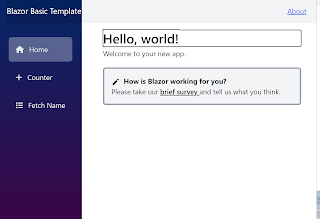
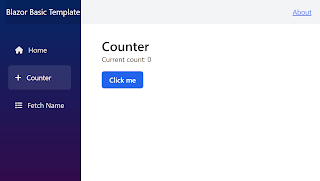
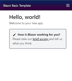
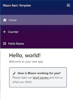
Result - Styled with Tailwindcss
Summary
This project took me about a week and a half longer than I thought it would have taken. But the lessons learned help explain why. As I stated above, for me, this was a very worthy technology to learn. I do plan to use Tailwindcss heavily moving forward.
I still have my backlog of projects to build but now I am
excited that styling the application is no longer the biggest headache.
[References]


%20built%20with%20Blazor.%20The%20scene%20features%20a%20dynamic%20web%20app%20running%20o.webp)

Comments
Post a Comment