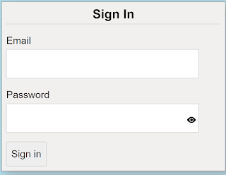
When you think about it, application sign-in forms would seem fairly straight forward and simple to do, considering that most applications have them. Make a form, add a couple of labels and inputs with a button and you are good to go.
When you stop and think about it though, there is a lot that goes into making a good sign in form. We are going to take a look at 5 best practices you can use when creating your next sign-in form. The key concept to keep in mind is to make it simple. You have to always consider that your users are not as computer savvy as you are.
The sample project that focuses on the sign-in form HTML and Blaozr code. There is no real authentication for the application. Any email and password, that meets the validation, will allow the user to get to the home section of the application. Please note this code will work on either server-side Blaozr of web assembly Blazor
We will look at each of the 5 best practices but from a Blazor standpoint.
5 Best Practices
- Use meaningful HTML
- Design for fingers and thumbs
- Take advantage of built-in browser functions
- Add UI element to toggle password display
- Use Form Validation
Use Meaningful HTML
This often referred to as semantic markup. You use HTML elements that describe their function. For a sign in form we will be using:
- <EditForm>
- <section>
- <label>
- <button>
For our Blazor sign in form it will look like this:
<EditForm>
<h2>Sign In</h2>
<section>
<label>Email</label>
<InputText @bind-Value="user.Email" />
</section>
<section>
<label>Password</label>
<InputText @bind-Value="user.Password" />
</section>
<button type="submit">Sign in</button>
</EditForm>
Design for fingers and thumbs
This practice is often forgotten. We often remember to make our apps responsive but we forget we need to leave room for people with fatter fingers and thumbs. We can achieve this by making sure we leave and making sure our inputs work well on mobile. We will increase our padding, margins, and font size on mobile. We have set a media tag for a min-width of 625px. This will adjust the form so it will fit and look good on a small mobile device.
Take advantage of built-in browser functions
The practice helps with not only the ease of use but with the accessibility as well.
- Use the "for" on the label
- Use the id attribute on the InputText and button
- Use the name attribute on the InputText
- Use clear text on the button. Use "Sign In" instead of "Submit" or something else that does let the user know exactly what they are doing.
- Do not use Placeholder text. This includes instead of labels or with labels. If you use placeholder text as labels once the user types in the input the text is gone and if they forget what they were doing they would have to refresh the page. Using placeholder text and labels is just redundant.
- Use the autocomplete attribute to help the browser know what type of data to lookup
- Since the "autofocus" attribute is still not working in Blazor, use the JS Interop solution to place the cursor in the email input box on page load.
Here is the updated Blazor HTML code with us using the built-in attributes:
<EditForm Model="@user" OnValidSubmit="@HandleValidSubmit" class="signin_form">
<h2>Sign In</h2>
<section class="signin_form_section">
<label class="signin_form_label" for="email">Email</label>
<InputText id="email" name="email" type="email" autocomplete="username" required autofocus @bind-Value="user.Email" class="defaultFocus" />
</section>
<section class="signin_form_section">
<label class="signin_form_label" for="password">Password</label>
<InputText type=@passwordType id="password" name="password" autocomplete="current-password" required minlength="6" maxlength="32" @bind-Value="user.Password" />
</section>
<button type="submit" class="signin_button">Sign in</button>
</EditForm>
Add UI element to toggle password display
This practice is fun to implement. When I first researched this I thought that this feature was built into the browser. It is not, we have to implement ourselves. The solution is fairly simple. You add a "button" that the user can click that exposes the characters of the password so the user can ensure they are typing it incorrectly.
For out button, we are using a bootstrap icon, the little eye. When the user licks on the eye we will simply change the type of the input from "password" to blank.
Here is the button:
<button type="button" class=" btn password_show_button" @onclick="ShowPassword">
<svg width="1em" height="1em" viewBox="0 0 16 16" class="bi bi-eye-fill" fill="currentColor" xmlns="http://www.w3.org/2000/svg">
<path d="M10.5 8a2.5 2.5 0 1 1-5 0 2.5 2.5 0 0 1 5 0z"></path>
<path fill-rule="evenodd" d="M0 8s3-5.5 8-5.5S16 8 16 8s-3 5.5-8 5.5S0 8 0 8zm8 3.5a3.5 3.5 0 1 0 0-7 3.5 3.5 0 0 0 0 7z"></path>
</svg>
</button>
You can see we have a click handler connected, "ShowPassword". Here is the button event handler:
private string passwordType = "password";
private void ShowPassword()
{
if (!string.IsNullOrEmpty(user.Password))
{
if (passwordType == "password")
{
passwordType = "";
}
else
{
passwordType = "password";
}
}
}
We have a variable, pawsswordType that we set based on whether the type is already site or not. We also make sure there are characters in the input control before doing our check. This is a nice safety check.
Use Form Validation
For this practice, we will use both the HTML validation attributes and the Blazor components to validate our input.
On the HTML side we are using:
- "required" on both the email and password fields
- "minlength" on the password field
- "maxlength" on the password field
Data annotations in the SignInModel
[Required]
[MaxLength(125)]
public string Email { get; set; }
[Required]
[MaxLength(32)]
[MinLength(6)]
public string Password { get; set; }
DataValidation Component on the form
<DataAnnotationsValidator />
Field-level validation component
email
<ValidationMessage For="@(() => user.Email)" />
password
<ValidationMessage For="@(() => user.Password)" />
Summary
For the best sign-in forms, keep it simple, use what is built into your environments and tools and you can give your users a nice experience. For the sample project, you simply put in an email with any password that meets the validation and you will be taken to the home page.


%20built%20with%20Blazor.%20The%20scene%20features%20a%20dynamic%20web%20app%20running%20o.webp)

Comments
Post a Comment